
We once watched a small sales team transform after one clear change: they stopped hunting for numbers and started trusting live information. The shift felt simple, but the results were fast. Teams aligned, meetings shrank, and decisions moved from guesswork to evidence.
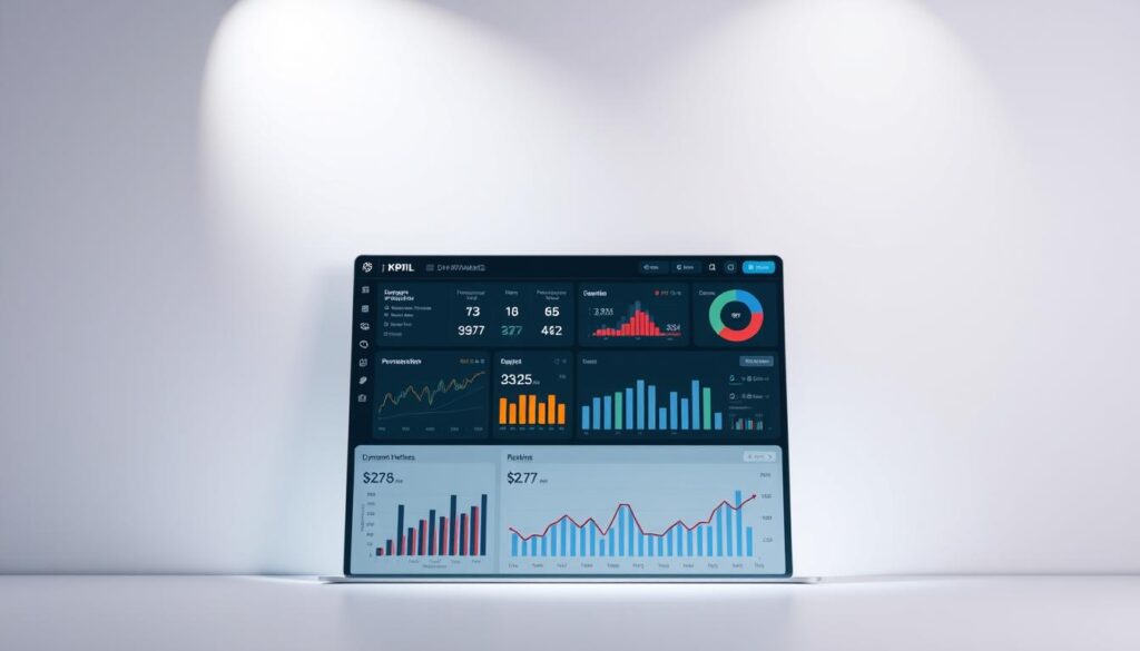
We build a central tool that pulls live data from CRMs and ERPs. It shows key performance indicators in real time, with interactive charts and easy drill-downs. That single view reduces manual reporting and gives leaders a reliable source of truth.
Our approach keeps business needs first. We map metrics to goals so insights lead to action. In this ultimate guide, we introduce what a kpi dashboard is, show why it matters for performance, and preview practical tips to build reports users actually use.
For Malaysia-based teams, WhatsApp us for more information at +6019-3156508 so we can tailor the tool to your audience and users right away.
Key Takeaways
- We explain how a single view turns data into faster decisions.
- The live tool supports drill-downs without extra coding.
- Centralized information reduces errors and aligns goals.
- Practical tips help you design charts and visual hierarchy users love.
- Every metric needs an owner and a clear target for action.
Why KPI Dashboards Matter in Malaysia Right Now
In Malaysia’s fast market, instant visibility into operations changes how teams act. Live views cut the delay between events and decisions. This matters when supply, demand, and customer patterns shift quickly.
Present-day pressures and opportunities
Real-time data gives your business a clear read on local spikes and supply challenges. With up-to-date metrics, marketing and sales adapt campaigns the same day.
How we align teams around shared targets
We map indicators to objectives so every team sees the same goals. Shared visibility reduces siloed reports and speeds consensus.
“When everyone trusts the same numbers, conversations become action plans.”
| Need | Benefit | Who |
|---|---|---|
| Faster response time | Lower lag between event and action | Operations & Sales |
| Clear targets | Aligned objectives across teams | Executives & Managers |
| Consistent data | Higher trust and accountability | Whole organization |
Want help mapping your performance indicators and strategic goals to Malaysia-specific conditions? WhatsApp us for more information at +6019-3156508.
What Is a KPI Dashboard?
A consolidated view makes current trends visible and decision-ready for every team.
Definition: We define a kpi dashboard as a live visual tool that translates multiple data sources into actionable insights your users can explore instantly.
From raw data to actionable insights
The tool pulls records via connectors and auto-refreshes on schedule. Interactive charts and graphs let users filter by segment or time and drill down without code.
Core components
- Indicators: Key performance indicators tied to goals.
- Visualizations: Clean charts and graphs for quick reading.
- Connectors: Reliable links to CRMs, ERPs, and other systems.
- Customization: Views tailored by audience and role.
| Feature | Benefit | Who |
|---|---|---|
| Auto-refresh | Always current trends | Managers & users |
| Filters & drill-downs | Faster, evidence-led decisions | Analysts & teams |
| Role views | Relevant info without IT | Executives & staff |
Start by defining each indicator and assigning ownership. For software options and implementation help, see our dashboard software guide.
Key Benefits of Tracking KPIs on a Dashboard
Our tools surface crucial trends early, so leaders can act before risks escalate.
Instant visibility gives your company early warnings and highlights the data that matters. Teams spot risks and opportunities faster and limit damage.
Clear insights to guide decisions. Visual views turn raw numbers into practical next steps. That leads to timely action and steady performance gains.
Research shows companies that adopt performance strategies tied to key performance indicators report real gains. About 68% see better growth, market share, and staff retention.
Less reporting, more progress. Automated views cut manual work so teams focus on analysis, not pulling numbers. That increases alignment across the organization.
“When everyone speaks the same metrics, decisions move faster and follow-through improves.”
- Single source of truth for consistent performance indicators.
- Regular refresh schedules keep insights reliable and timely.
- Focused KPI sets help prioritize resources and drive strategic wins.
kpi dashboard
A live command view lets teams catch trends early and respond before small gaps widen. We split three common formats so you know which to use when time matters.
The difference between dashboards, metric views, and reports
Dashboards act as a live command center. They surface a few critical numbers and alerts so teams can act in the moment.
Metric views list many measures for deeper analysis. These views help analysts drill into trends and test hypotheses.
Reporting packages are scheduled snapshots. They tell the story of historical data and show progress toward targets over weeks or months.
When to use each for decisions over time
Start at the live view to act fast. If something looks off, move to metric views to diagnose causes.
Use reports to align stakeholders and recap progress toward goals. Reports work best for reviews and planning cycles.
- Live panels for day-to-day monitoring and quick fixes.
- Metric lists for root-cause analysis and longer investigations.
- Scheduled reporting for storytelling with historical data.
Tip: Keep data definitions consistent across these formats so conclusions match and teams trust the information.
Types of KPI Dashboards for Different Audiences
We design focused views so executives, operators, and analysts all see what matters most.
Four focused types help each audience act on timely data. Below we define each type, suggest performance indicators, and give simple layout examples you can copy.
Strategic views for executives
These show company-level kpis like revenue growth, churn, and long-term trends tied to strategic goals.
Layout: top-line scorecards, trend lines, and a short risks section. Keep it one scroll for quick board reviews.
Operational views for daily performance
Operational pages display real-time data for frontline teams. Use live status tiles and alerts so managers can react fast.
Suggested kpis: throughput, SLA adherence, and queue sizes for sales or operations.
Analytical views for deep trends
Analytical sections support exploration and correlation. Analysts look for patterns that inform marketing and sales tactics.
Structure: multi-filter charts, cohort tables, and drill paths to raw data.
Tactical views for teams and projects
Tactical panels track milestones, blockers, and task completion for a project or campaign.
Example layout: milestones timeline, task status grid, and root-cause notes so the team can fix issues quickly.
Keep definitions consistent. Use the same data names and refresh rules across these views so performance indicators remain comparable.
| Audience | Primary kpis | Layout example |
|---|---|---|
| Executives | Revenue growth, churn, margin | Scorecards + trend lines |
| Operations | Throughput, SLA, backlog | Live tiles + alerts |
| Analysts | Conversion rates, cohorts, correlations | Filters + drill paths |
| Teams | Milestones, tasks, blockers | Timeline + status grid |
“Tailor views to audience and the data will guide clearer action.”
Role-Based KPI Bundles You Can Deploy
We group role-specific metrics into compact bundles so every leader can act fast.
Below are ready-to-deploy packs that map indicators to targets, owners, and triggers. Each bundle is built for practical use by Malaysian teams and includes a simple action path when thresholds are missed.
Executive
- Focus: revenue growth, retention, efficiency, NPS.
- Use: targets, owners, and automated action triggers tied to alerts.
Sales
- Focus: pipeline coverage, win rate, cycle length, forecast accuracy.
- Benefit: clearer decisions from reliable sales data and velocity signals.
Marketing
- Focus: CAC, payback period, channel ROI, MQL-to-SQL conversion.
- Benefit: efficient growth measurement that drives campaign action.
Customer Success & Support
- Focus: response time, CSAT, renewal health.
- Benefit: links experience to renewals and retention playbooks.
Operations & Supply Chain
- Focus: OEE, on-time delivery, flow reliability.
- Benefit: reduce disruptions and keep fulfillment steady.
HR & Finance
- Focus: time-to-hire, expense ratio, runway.
- Benefit: balance capacity, control, and financial planning.
“We present curated kpis by role, making it easy for teams to deploy dashboards used in real operations.”
| Role | Key indicators | Owner / Trigger |
|---|---|---|
| Executive | Revenue growth, NPS, retention | CEO / Auto task if retention |
| Sales | Pipeline coverage, win rate | Head of Sales / Flag deals when velocity drops |
| Marketing | CAC, payback, channel ROI | CMO / Pause channels below ROI |
| Support | Response time, CSAT, renewals | Head of Support / Open ticket for low CSAT |
| Ops & HR/Finance | OEE, on-time delivery, time-to-hire, runway | COO / Auto-escalate supply issues |
KPI Dashboard Design Principles That Drive Clarity
Clear layout and purposeful cues let teams find the right number without guessing. Good design uses affordance — visual signals that show what is clickable, editable, or interactive.
Affordance, accessibility, and information hierarchy
We use accessible color contrast and clear labels so information reads well on phones and desktops. Place primary indicators top-left and center to match natural eye flow.
Simplicity and visual hierarchy for fast scanning
Keep fewer than ten primary metrics per view. Pair each indicator with a target and an owner so every number points to action.
Design patterns that work—and anti-patterns to avoid
- Favor simple charts and clear legends; avoid orphaned graphs that lack context.
- Use consistent time windows and labels so comparisons stay trustworthy.
- Provide drill paths and annotations so spikes have explanations, not confusion.
Clean data and thoughtful design together improve performance outcomes.
Building Your First KPI Dashboard: A Practical Workflow
Begin with a clear purpose: what decision should this view enable and which team will act on it? When we fix the why and the audience first, the rest becomes focused and fast.
Start with the why and know your audience
We recommend picking 5–10 metrics that map directly to objectives or goals. Fewer numbers keep views scannable and useful for busy Malaysian teams.
Limit KPIs, choose the right visuals, and automate refreshes
Connect trusted data sources and set time-based refresh schedules so trends stay current. Use line charts for trends, bar charts for comparisons, and gauges for target checks.
Add context: goals, benchmarks, and historical data
Every metric needs context. Pair each measure with a target, a short benchmark, and at least 90 days of historical data so users see direction, not just a number.
Iterate based on feedback and evolving needs
Pilot your initial view with a small group, gather feedback, and change what users find unclear. Document definitions and owners so the view scales without confusion.
“Start small, automate refreshes, and improve quickly based on real use.”
- We walk through a build that starts with objectives and audience clarity to ensure actionable insights.
- Limit metrics to the vital few so views remain scannable.
- Connect reliable data sources and automate refreshes to save time.
- Choose visuals that make trends and comparisons obvious.
- Add goals, benchmarks, and historical data so metrics mean something.
- Pilot, collect feedback, iterate, and document every definition as the tool grows.
Choosing KPI Dashboard Software
Choose software by mapping scope, integrations, and who will use it. Start with a short list of data sources, user roles, and the key reports you need. This keeps selection practical and local to Malaysia use cases.
Match features to needs:
Match features to needs: from simple to BI-grade
We compare tools from lightweight scorecards to full analytics suites. Pick a tool if it supports your connectors, visual flexibility, and mobile users. Simple products suit small teams. BI-grade platforms fit larger companies and complex data needs.
Budget considerations: users, data, KPIs, and dashboards
Pricing varies by users, data volume, and the number of dashboards and KPIs. Factor in storage, refresh rates, and expected growth to avoid surprise costs.
Notable providers and what to evaluate
Look for strong connectors, governance, reporting depth, and dashboard design flexibility.
| Provider | Best for | Strength |
|---|---|---|
| Klipfolio | SMBs | Easy connectors & quick setup |
| Geckoboard | Wallboard views | Simple scorecards and alerts |
| SimpleKPI | Operational KPIs | Target tracking and playbooks |
| Tableau | Enterprise analytics | Deep analytics and visuals |
| Yellowfin | Embedded BI | Governance and storytelling |
Final tip: Run a pilot to validate performance, support, and total cost before committing.
From Insight to Action: Alerts, Playbooks, and Tasks
Turning an insight into a concrete task shortens the gap between noticing and fixing a problem.
Attach threshold alerts to each kpi so owners are notified instantly when targets slip. Prioritize critical alerts to keep noise low and response times fast.
Threshold alerts and recommended next steps
When an alert fires, include the recommended next step and a link to the relevant record. That reduces back-and-forth and speeds decisions.
Embedding playbooks and creating tasks automatically
We embed step-by-step playbooks that map the fix and who owns it. Tasks are auto-created in work tools with owners and deadlines to ensure follow-through.
Scheduling digests that keep teams accountable
Send weekly digests summarizing wins, risks, and next steps so progress is visible and momentum stays steady.
- Alerts convert insights into immediate action by pinging owners.
- Playbooks standardize responses so decisions remain consistent.
- Auto-tasks add context, owners, and deadlines for measurable progress.
| Feature | Benefit | Owner |
|---|---|---|
| Threshold alerts | Faster response to breaches | Metric owner |
| Embedded playbooks | Repeatable remediation steps | Operations lead |
| Auto-task creation | Clear ownership and deadlines | Team manager |
| Weekly digest | Accountability and trend capture | Team lead |
“Use dashboards as the single hub where actions, notes, and data live together.”
Governance and Trust: Your Single Source of Truth
When every number shows its source and last refresh, users trust the view and act faster. We set simple rules so the whole team treats the tool as the single source of truth.
Data lineage and refresh SLAs
Display last refresh time and lineage on every tile. This shows where each data point comes from and when it was updated, so the number is easy to verify.
Glossaries and consistent definitions
We maintain a live glossary for terms like CAC and OEE. That standardizes indicators and preserves comparability across historical data and reporting.
Access controls and change management
Role-based access protects sensitive business metrics while allowing collaboration. We version metric definitions and publish change logs so trends remain trustworthy.
- Name an owner for every tile to boost accountability.
- Run periodic audits to validate sources and ensure dashboards still meet team needs.
- Announce definition changes and keep a clear change history.
| Practice | Why it matters | Owner |
|---|---|---|
| Tile refresh & lineage | Confirms current number and source | Data Owner |
| Live glossary | Consistent indicators across teams | Analytics Lead |
| Role-based access | Protects sensitive business data | Security Admin |
| Version control | Preserves comparability over time | Metrics Owner |
“Governance speeds adoption by building confidence across the organization.”
30/60/90 Plan to Launch or Fix a KPI Dashboard
Begin by picking a single use case so you can measure progress toward real goals quickly. This three-step plan shows visible wins, reduces noise, and keeps teams focused on the right work.
Days 0–30: Align and define
Choose one audience and a clear purpose. Finalize 5–10 kpis, assign owners, and confirm simple definitions.
Set refresh SLAs so every tile shows when it was last updated. This step makes early progress obvious and builds trust.
Days 31–60: Build and pilot
Ship a focused v1 with trends, targets, and context. Add alerts for critical kpis so owners receive timely nudges.
Run a two-week pilot. Capture feedback on layout, metric clarity, and whether the view supports faster decisions.
Days 61–90: Harden and scale
Add role-based views, a live glossary, and access controls. Schedule weekly digests and document playbooks for common fixes.
Plan quarterly reviews to keep metrics relevant and to show ongoing progress. We treat this as a repeatable method to fix underperforming tools, not just a one-off launch.
“Start small, measure progress, and scale what actually helps teams make faster decisions.”
- We provide a concrete timeline so your team can show progress quickly and visibly.
- We recommend early alerts and minimal automations to close the loop from insight to action.
- Capture pilot feedback to refine layouts and metrics before wider rollout.
Proving Value: A Mini ROI Calculator and Success Metrics
We make ROI simple so teams can show clear returns from better reporting and faster action. Below is a compact model you can run with conservative inputs and credible benchmarks.
Time saved, revenue lift, and cost avoidance
ROI formula: (time saved per user per week × number of users × hourly cost) + revenue lift + cost avoidance − build & run costs = net benefit.
Examples of inputs:
- Time saved: 1.5 hours/week × 20 users × RM 50/hour
- Revenue lift: churn reduction × ARR at risk × improved save rate
- Cost avoidance: fewer expedites, less ad waste, and lower overtime
Before-and-after benchmarks that matter
Gather baseline metrics for a 30–60 day period before rollout. Track the same metrics after launch.
Key metrics to collect: time logs, conversion rates, churn at segment level, expedite spend, and alert resolution time. Use conservative estimates to keep the number credible.
| Metric | Before | After | Impact |
|---|---|---|---|
| Weekly time saved per user | 0.5 hrs | 2.0 hrs | Productivity gain |
| Churn rate (monthly) | 4.5% | 3.5% | Revenue preserved |
| Overtime spend | RM 8,000 | RM 4,000 | Cost avoided |
| Alert resolution time | 24 hrs | 6 hrs | Faster fixes |
Pair simple charts and graphs with a short narrative so stakeholders see both the math and the story. Link each ROI line to the dashboards used and cite the adoption and alert metrics that prove impact.
Tip: Review this ROI every quarter. That keeps the case current and supports steady growth for your company and its performance initiatives.
Talk to Us in Malaysia: Get the Ultimate Guide and WhatsApp Support
Reach out in Malaysia and get a tailored action plan that turns data into everyday decisions.
WhatsApp us for more information at +6019-3156508
How we help you choose KPIs, build dashboards, and train teams
We provide hands-on support to define meaningful kpi aligned to your goals. We connect your data sources and pick the right tools for your users.
We set up alerts, playbooks, and weekly digests so reporting becomes proactive. Our team trains each team so the view becomes a daily habit, not just a monthly review.
- Personalized guidance for Malaysia-based teams via WhatsApp.
- Role-based views for sales, marketing, operations, finance, and HR.
- Standardized reporting, governance, and post-launch tuning.
“We turn metrics into actions so your organisation moves faster and with confidence.”
| Service | Benefit | Who |
|---|---|---|
| KPI selection | Clear goals and owners | Leadership & teams |
| Data integration | Reliable, single source | Analytics & IT |
| Training & adoption | Daily use by users | All teams |
| Alerts & playbooks | Faster fixes, less drift | Operations & Support |
结论
When data, owners, and targets align, decisions follow naturally. A clear kpi dashboard unifies your audience around the right numbers and reduces manual reporting so teams spend time on work, not chasing reports.
Great dashboards make key performance indicators visible at a glance. They turn raw data into insights that guide fast decisions and repeatable action.
Use simple design rules, governance, and our 30/60/90 plan to pilot and scale. Iterate with analytics and examples, measure progress, and track growth from time saved, revenue lift, and cost avoidance.
Ready to move from plan to performance in Malaysia? WhatsApp us at +6019-3156508 and we’ll help you get value fast.
FAQ
What makes our KPI dashboard solutions different from basic reporting tools?
We combine clear metrics, tailored visuals, and automated data connectors so teams get timely, actionable information. Instead of static reports, our approach focuses on measurable goals, trend context, and widgets that support decisions — helping marketing, sales, operations, and leadership act faster and more confidently.
Why do performance dashboards matter for Malaysian businesses today?
Rapid market shifts and competitive pressure mean organizations must track progress toward strategic goals in real time. Dashboards give leaders and teams a single view of growth, targets, and operational health so we can spot trends, reduce risk, and prioritize initiatives that drive revenue and efficiency.
How do we align teams around shared goals and targets?
We start by defining objectives with stakeholders, then map a concise set of indicators to those goals. Shared views, role-based bundles, and scheduled digests keep everyone focused on the same priorities, while alerts and playbooks translate insight into coordinated action.
What exactly is a KPI dashboard and how does it turn data into insight?
A dashboard aggregates metrics, visualizations, and contextual notes into a single interface. By linking historical data, benchmarks, and thresholds, it surfaces patterns and deviations so we can move from raw numbers to recommended next steps quickly.
What are the core components we include in a dashboard?
Essential elements include clearly defined indicators, compact charts and gauges, data connectors for live refreshes, filters for audiences, and customizable layouts. Together they create a trustworthy, easy-to-scan workspace that supports fast decisions.
How do dashboards differ from metric views and formal reports?
Dashboards focus on current performance and quick insight. Metric views are single-metric lenses for monitoring, while reports provide deep, paginated analysis and storytelling. We use each format depending on whether teams need operational alerts, trend analysis, or documented evidence for stakeholders.
When should we use each format to make decisions over time?
Use operational views for daily task management, strategic dashboards for quarterly decisions, and analytical reports when investigating root causes or preparing board-level reviews. Mixing formats ensures fast action today and informed planning tomorrow.
What types of dashboards work best for different audiences?
Executives need high-level strategic dashboards showing growth and efficiency. Operations benefit from real-time operational panels. Analysts require deep-dive tools for trend exploration. Project teams use tactical views focused on milestones and deliverables.
Which role-based KPI bundles do we recommend deploying first?
Start with executive bundles for growth and retention, sales bundles for pipeline health, marketing bundles for efficient scaling, customer success bundles for renewals, and operations bundles for flow and reliability. HR and finance bundles help with capacity and runway planning.
What design principles make dashboards easy to use?
We prioritize simplicity, clear information hierarchy, and accessible interactions. Use consistent labels, limit visual variety, and surface only the most relevant metrics so users can scan, interpret, and act within seconds.
What workflow do we follow to build a first dashboard?
We begin with the why and audience, limit indicators to those tied to objectives, pick visuals that match the metric type, and automate refreshes. We add context like goals and benchmarks, then iterate based on user feedback.
How do we choose the right dashboard software?
Match features to needs: simple tools for basic tracking, BI-grade platforms for complex analytics. Consider user seats, data sources, refresh rates, and integration needs. Evaluate vendors on security, scalability, and ease of use.
How do alerts, playbooks, and tasks turn insight into action?
Threshold alerts notify owners when metrics deviate. Embedded playbooks recommend next steps. Automated task creation and scheduled digests ensure accountability so teams act on signals rather than just observing them.
What governance measures ensure dashboards remain a single source of truth?
We enforce data lineage, refresh SLAs, consistent glossaries, and role-based access controls. Change management processes and documented definitions keep reports trustworthy and reduce confusion across teams.
How quickly can we launch or fix a dashboard using a 30/60/90 plan?
In the first 30 days we align stakeholders and define indicators. Days 31–60 focus on building and piloting core views. Days 61–90 harden processes, scale access, and optimize performance for broader adoption.
How do we prove the value of a dashboard investment?
We track time saved, revenue lift, and cost avoidance. Before-and-after benchmarks and simple ROI calculations show impact on efficiency and outcomes, making it straightforward to measure success.
How can Malaysian teams get direct support and the ultimate guide?
Whatsapp us at +6019-3156508 for personalized advice. We help you choose relevant indicators, build tailored views, and train teams to use insights for faster, better decisions.