
We built this guide to help Malaysian teams turn strategy into action. A quick story: we once worked with a small café in KL that tracked twenty things and couldn’t see what mattered. We helped them pick three real numbers and their daily decisions changed overnight.
This guide explains what a key performance indicator is and how a simple template makes performance visible. We show practical examples across marketing, finance, HR, operations, customer service, and IT so each team can measure what drives growth.
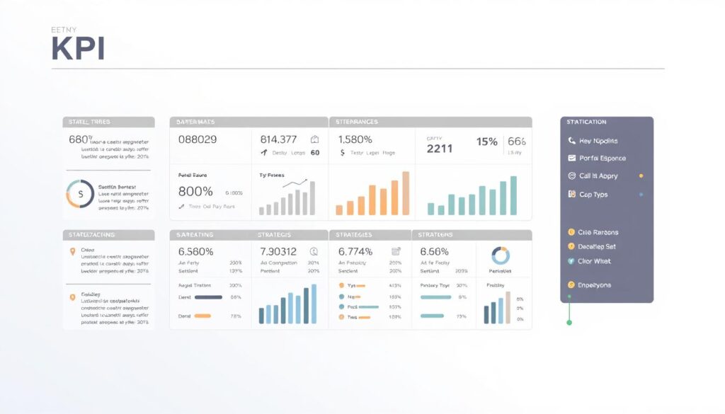
Expect step-by-step help: selecting indicators, building dashboards, and copying sample fields for your specific business. A consistent approach reduces confusion and speeds decisions.
If you want tailored help, WhatsApp us at +6019-3156508.
Key Takeaways
- We show how a clear key performance framework links daily work to strategic goals.
- A small set of trusted kpis beats a long list of vague measures.
- Department-ready examples cover marketing, finance, HR, ops, service, and IT.
- You’ll get templates and checklists to apply immediately in Malaysia.
- Contact us on WhatsApp at +6019-3156508 for personalised setup.
Why a clear KPI format matters for Malaysian businesses today
A clear set of indicators turns strategy into everyday decisions for Malaysian teams. A good key performance definition shows whether an organisation is on track against its strategic goals.
Aligning key performance indicators to strategic goals
We ensure every metric supports what leadership needs this quarter and this year. When indicators map to objectives, teams focus on outcomes, not tasks.
Standardising the template stops arguments about definitions in meetings. A proper template names the audience, KPQ, formula, targets, data source, owner, and review date.
- Clear objectives prevent reporting bloat and cut vanity metrics.
- Shared definitions improve collaboration between marketing and sales on conversion rate and pipeline.
- Governance and version control protect report integrity over time.
In short, a small set of well-designed indicators speeds decisions, lowers reporting errors, and creates a living library of measurable insights for the whole business.
The essential KPI template: fields to include in your format
We use a compact template so teams can build reliable indicators without overcomplicating data collection.
Start by naming the strategic goal and the Key Performance Question (KPQ). That links every measure to a clear business objective and the decision it informs.
Audience, access, and ownership
List who sees the report, who can edit it, and which managers own data entry and approvals.
Indicator details and data
Include indicator name, formula/scale (for example, 0–10 NPS or percentage rate), and the authoritative data source.
Targets, frequency, cost, and risk
Document targets and thresholds, collection and reporting cadence, expiry/revision date, and estimated cost to measure.
Also add a completeness note and likely unintended consequences so teams avoid gaming the metric.
- Governance checklist for updates and version control.
- Compact annex with kpi examples for revenue, conversion rate, and project delivery.
format kpi
We walk teams through a simple, repeatable path from strategic aim to measurable result.
Step-by-step: from objective to indicator and target
First, name the objective clearly and write a Key Performance Question that guides decisions.
Next, pick an indicator and define its formula, unit, and collection method in the template.
Set a realistic target and threshold using recent baseline data. Assign ownership and a review date so the measure stays current.
Choosing leading vs. lagging indicators that fit your goals
Leading indicators give early warning — for example, productivity often predicts lower labor cost. Lagging indicators report outcomes, like sickness rate or labor cost per employee.
We recommend pairing both types so managers get fast signals and confirmed results over time.
| Use case | Leading measure | Lagging measure |
|---|---|---|
| Sales enablement | Sales-qualified meeting rate | Closed-won percentage |
| Project delivery | On-time milestone completion | Project schedule variance |
| Operations | Daily productivity rate | Labor cost per employee |
Quick checklist: clarify objectives, craft the KPQ, select indicators, set formula and targets, verify data source, assign ownership, run validation, and schedule the review. Document assumptions and capture risks to avoid unintended side effects.
How to set SMART and Eckerson-aligned KPIs
High-value metrics are concise, traceable, and built so teams can act fast. We combine SMART rules with Eckerson’s guidance so each indicator supports clear objectives and day-to-day management.
Using SMART to keep indicators specific and actionable
SMART means Specific, Measurable, Attainable, Relevant, and Time-bound. We write each key performance indicator with a one-line decision it supports, the formula, and the cadence.
Example: Internal promotion rate — percent of roles filled from within, measured monthly. It is specific, measurable, attainable via development programs, relevant to talent goals, and time-bound for monthly tracking.
Applying Eckerson: sparse, drillable, simple, aligned
Good measures are sparse and simple. We keep the dashboard to a few performance indicators so managers focus on what moves outcomes.
- Make metrics drillable: capture drill paths (channel, product, segment) in the template.
- Assign a clear owner for each indicator with review responsibilities.
- Map thresholds to decision rules so teams know what to do when a rate slips below a red line.
- Include data quality checks in the template before numbers reach the dashboard.
Align measures across sales, project delivery, and cost so one function’s gain doesn’t harm another. Set review cycles to match planning cadences so insights lead to timely action.
Department-ready KPI examples you can plug into your template
Here are tested indicators you can plug into a dashboard to show what truly moves performance.
Marketing: MQLs, conversion rate, cost per acquisition, organic traffic, NPS, plus social media engagement and share of voice. Use source tags (CRM, Google Analytics, ad platforms) and show percentage lifts on the dashboard.
Sales & finance: revenue, average order value (AOV), gross and net profit margins, cash conversion cycle, and budget variance. Mark daily lead activity and monthly revenue for clear cadence.
Operations: labor utilization, operating margins, project schedule variance, rework rate, and complaints. Roll project health into an exec view so managers see which projects need attention.
Customer service: CSAT, first contact resolution, retention rate, number of issues, and cost per conversation. Separate customer-experience metrics from internal-efficiency metrics on dashboards.
HR: turnover percentage, internal promotion rate, training ROI, quality of hire, and eNPS. Link these to employee development programs and report monthly.
IT: total/open/reopened tickets, projects on budget, critical bugs, and IT cost vs revenue. Add drill paths by system, module, or priority for fast root-cause checks.
Quick setup tip: pick defaults for formula, frequency, and target and share standard definitions so cross-functional managers use the same names and avoid confusion.
Designing metrics that managers and teams will actually use
Dashboards work best when each view is tied to a role and a decision. We design reports so the board, managers, and teams see what matters to them.
Boards want a sparse executive dashboard with aligned KPIs that show strategic progress. Managers need drillable dashboards with diagnostics and clear thresholds. Teams require operational metrics they can control day-to-day.
We match reporting cadence to data collection. A monthly kpi dashboard works with monthly collections. Quarterly reviews focus on strategy and resource choices.
- Role-based dashboards: sparse board view, drillable manager view, operational team view.
- Standardised report templates and legends to keep definitions consistent across sales and regions.
- Time-boxed reviews that end with owners, actions, and due dates recorded.
- Lightweight tool checklist: exports, filters, and alerts to reduce friction.
| Audience | Primary view | Cadence |
|---|---|---|
| Board | Sparse strategic KPIs | Quarterly |
| Managers | Drillable diagnostics and rates | Monthly |
| Team | Operational metrics and actions | Weekly to monthly |
Building your KPI dashboard: data, tools, and visualization tips
A well-built dashboard makes busy managers spot risks before they become crises.
We start by converting spreadsheets into a single source of truth. Inventory each metric, add a clear formula, and list the authoritative data source. Keep names consistent with your template so comparisons across teams stay fair.
From spreadsheets to KPI dashboards: what to track and how
Track core metrics for each function: IT (total/open tickets, projects on budget), Service (FCR, CSAT, retention), and Marketing (MQLs, NPS).
Decide refresh cadence — daily for operations, weekly for sales, monthly for strategy — and validate numbers before they reach the executive report.
Creating drill-downs for insights, not just indicators
Design drill paths by channel, campaign, product, and region. Drill-downs should answer “why” quickly so teams can act in time.
- Tool criteria: connectors, role-based access, alerts, and export options.
- Visualization playbook: thresholds, trend lines, and simple comparisons.
- Integration tip: preserve definitions from your template when importing spreadsheets.
| Need | Suggested refresh | Example metric |
|---|---|---|
| Operations | Daily | Daily productivity rate |
| Customer service | Weekly | First contact resolution (FCR) |
| Marketing | Weekly to monthly | MQLs and NPS |
| IT | Daily to weekly | Total/open tickets |
Cost checklist: licence fees, connectors, storage, and ongoing maintenance. Budget for data owners’ time to validate numbers.
We invite you to WhatsApp us at +6019-3156508 for tailored tool recommendations and a dashboard setup that fits your stack and team size.
Worked example: Net Promoter Score KPI from template to target
This worked example turns the abstract Net Promoter Score into a repeatable process your service team can run monthly. We map each template field so the net promoter score becomes an actionable performance indicator.
Indicator definition, data collection, and formula
Indicator name: Net Promoter Score (NPS).
Data collection: Ask customers “How likely are you to recommend us to a friend?” on a 0–10 scale. Sample 10% of active customers monthly and use neutral outreach scripts to reduce bias.
Formula: NPS = percentage of Promoters (9–10) minus percentage of Detractors (0–6). Report the percentage with response count and a 95% confidence interval so teams avoid overreacting to noise.
Setting targets and thresholds for service and satisfaction
We set a year-end target of 55% with red/amber/green bands. Tie actions to each band: service recovery for red, targeted coaching for amber, scaling initiatives for green.
- Source of data: survey of existing customers; monthly reporting.
- Owner: named role in the template; review in 12 months; expiry/revision date recorded.
- Cost & completeness: moderate cost, lower than legacy programs; supplement with qualitative feedback.
- Safeguards: sampling controls, audits, and neutral scripts to prevent promoter score gaming.
Pair the net promoter result with CSAT and retention rate to capture both relational and transactional satisfaction. Add verbatim feedback coding and track related performance indicators such as first contact resolution and complaint rate to diagnose drivers behind score movements.
| Metric | Frequency | Action |
|---|---|---|
| Net Promoter Score (percentage) | Monthly | Service recovery, UX projects, sales follow-up |
| CSAT (percentage) | Weekly to monthly | Fix transaction issues |
| First Contact Resolution (rate) | Weekly | Operational improvements |
Finally, we link NPS shifts to sales outcomes and specific projects like onboarding or support SLAs. That turns a promoter score from a single percentage into clear, actionable performance insight.
Conclusion
We finish with clear steps to embed disciplined metric management into routine work. Start by finalizing goals, confirm template fields, and pick a short list of trusted kpis so your dashboard stays focused and useful.
Give managers clear ownership and equip each team with actionable measures tied to decisions. Validate data sources, document formulas, and publish report cadences so leaders can trust the numbers in every meeting.
Reuse department patterns from marketing, sales, service, HR, operations, and IT to speed time-to-value. Pilot two or three dashboards, compare percentage change over time, and refine based on team feedback to reduce cost and improve project delivery.
Want help tailoring the template and building a practical kpi dashboard? WhatsApp us at +6019-3156508 — we’ll help you set up dashboards that drive performance and long-term success.
FAQ
What does our KPI format guide cover for Malaysian businesses?
We explain how to align performance indicators with strategic goals, reduce ambiguity with a consistent template, and build dashboards that teams actually use. The guide includes fields to capture goals, audiences, ownership, formulas, targets, collection frequency, costs, and risks so you can track results and improve decision-making.
Why does a clear KPI template matter for our company?
A consistent template removes confusion about what we measure and why. It helps us connect indicators to strategic objectives, assign ownership, set thresholds, and ensure data is collected and reported reliably — which speeds up decisions and improves outcomes across marketing, sales, operations, HR, and service teams.
What essential fields should we include in each indicator entry?
Each entry should state the strategic goal, the Key Performance Question, the audience and access level, the indicator name, the formula or scale, the data source, targets and thresholds, review or expiry date, collection and reporting frequency, measurement cost, and potential unintended consequences.
How do we choose between leading and lagging indicators?
We pick leading indicators when we want early signals to steer activity (like MQLs for marketing) and lagging indicators to measure final outcomes (like revenue or net promoter score). A balanced set helps us manage performance now and verify results later.
How do we apply SMART and Eckerson principles to our indicators?
We make indicators Specific, Measurable, Achievable, Relevant, and Time-bound. Using Eckerson’s approach, we keep metrics sparse, drillable, simple, and aligned to strategy so managers can get insight fast without clutter.
Can you give examples of department-ready metrics we can plug in?
Yes. For marketing: MQLs, conversion rate, cost per acquisition, organic traffic, and net promoter score. Sales and finance: revenue, average order value, profit margins, cash conversion cycle. Operations: labor utilization, operating margins, project schedule variance. Service: CSAT, first contact resolution, retention rate. HR: turnover, internal promotion rate, training ROI, eNPS. IT: ticket counts, projects on budget, critical bug rate.
How should we match dashboards to different audiences?
Tailor dashboards by audience: boards need strategic summaries and trend context; managers require drillable metrics and variance explanations; teams want daily or weekly operational measures and clear tasks. Align visuals and cadence so each group sees what matters most to their role.
What’s the right reporting cadence for a KPI dashboard?
Use a mix: operational teams often need weekly or daily views, managers benefit from monthly dashboards, and executives focus on quarterly strategic reviews. We recommend aligning frequency with decision cycles to avoid overload and keep metrics actionable.
What tools should we consider to build a reliable dashboard?
Start with spreadsheets for small-scale tracking, then move to business intelligence tools like Microsoft Power BI, Tableau, or Google Data Studio as complexity grows. Ensure data sources are documented, visualizations are consistent, and drill-downs are enabled for root-cause analysis.
How do we implement a Net Promoter Score (NPS) indicator end to end?
Define the indicator and question, decide sampling cadence and channels, collect raw responses, compute the promoter/detractor ratio using the standard NPS formula, set targets and thresholds for improvement, and assign ownership for follow-up actions and monthly reporting.
How do we account for measurement cost and unintended consequences?
Estimate data collection and analysis costs before adopting an indicator. Review whether a metric incentivizes unwanted behavior and include mitigation actions in the template. We track these risks and revisit them at each indicator review to keep measurement practical and ethical.
How often should we review and retire indicators?
Review indicators at least quarterly and retire or revise them when they no longer link to strategic goals, the cost to measure outweighs benefit, or they consistently hit or miss targets without meaningful insights. Set an expiry date in each template entry to trigger reviews.
Can our small business use the same template as a large enterprise?
Yes. The core fields remain useful for any size organization, but we scale complexity. Small teams may track fewer indicators with simpler data sources, while larger organizations add governance, ownership hierarchies, and automated dashboards to manage scale.
What makes a metric actionable rather than just descriptive?
Actionable metrics connect to a clear decision or change we can make. They are timely, tied to ownership, and include thresholds that trigger predefined actions. We design indicators so they prompt specific next steps, not just retrospective reporting.
How do we ensure data quality for our performance indicators?
We document data sources and collection methods, enforce access controls, validate inputs, and run regular reconciliations. Assigning owners and setting automated checks in dashboards reduces errors and keeps the indicator trustworthy for decision-making.